CONCEPT ANCHOR 1:
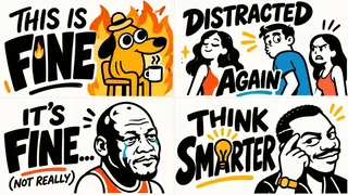
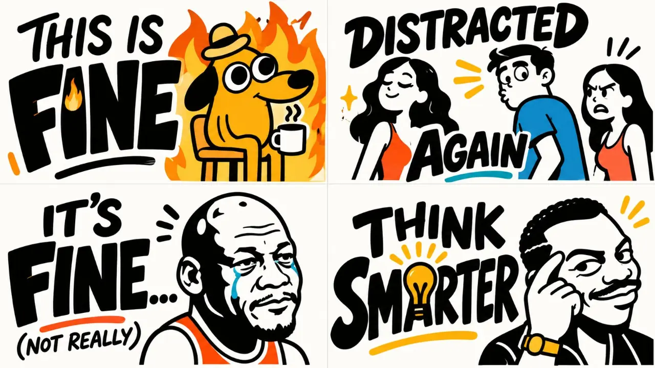
"Humorous hand-lettered editorial poster — oversized irregular black lettering, expressive marker-written phrases, mixed uppercase typography and casual script, playful typographic rhythm, bold character silhouettes, exaggerated facial expressions, sparse warm accent colors, generous white negative space."
::
CONCEPT ANCHOR 2:
"Semantic typographic logo design — bold geometric letterforms transformed through meaningful object substitutions, clever visual puns, recognizable subject-specific symbols integrated into stems, counters, terminals, and negative spaces, minimalist vector precision, strong visual readability."
::
CONCEPT ANCHOR 3:
"Minimalist anthropomorphic illustration — simplified expressive characters, exaggerated silhouettes, thick irregular black shapes, tiny facial details, emotional humor, intelligent relationships between lettering and illustration, restrained visual storytelling."
INSTRUCTION:
Find the exact visual center of these three concepts.
Ignore literal cats, coffee cups, inventors,
and specific names or slogans.
Extract only their underlying visual DNA.
Transform $ SUBJECT into a clever typographic
character poster where:
- Words communicate the central idea.
- Letterforms visually embody the subject.
- A minimalist illustration adds personality.
- Typography and illustration interact.
- Humor emerges naturally from the subject.
SUBJECT INTERPRETATION:
Analyze $ SUBJECT and infer:
1. Its primary recognizable identity.
2. Its defining objects or visual symbols.
3. Its emotional personality.
4. Its most interesting contradiction.
5. Its cultural or conceptual associations.
6. A short memorable phrase.
7. A potential visual pun.
8. The best character or object to personify.
Do not introduce unrelated imagery.
TYPOGRAPHIC SYSTEM:
Create two complementary lettering languages.
A. PRIMARY SEMANTIC WORDMARK
- Bold, compact geometric lettering.
- Strong black letter silhouettes.
- Carefully controlled spacing.
- Integrated subject-related visual symbols.
- Selective manipulation of letter anatomy.
- Highly readable at a glance.
- One dominant visual transformation.
Possible transformations:
- A letter becomes a recognizable tool.
- A counter becomes a symbolic illustration.
- A curve follows a subject-related shape.
- A letter becomes an expressive character.
- Two letters share a meaningful visual element.
- A symbol is revealed through negative space.
B. EXPRESSIVE HAND-LETTERED MESSAGE
- Playful hand-drawn black lettering.
- Mixed large capitals and informal script.
- Slightly uneven strokes and baselines.
- Deliberately varied letter widths.
- Organic brush and marker characteristics.
- Emotional emphasis through typography.
- Natural, imperfect rhythm.
The headline should feel written
with personality rather than typeset.
CHARACTER CONSTRUCTION:
Invent a simplified character or
expressive object based on $ SUBJECT.
Convert its visual identity into:
- Bold black silhouette.
- Simple rounded or angular shapes.
- Exaggerated distinctive features.
- Two or three expressive facial details.
- Minimal white negative-space highlights.
- Small subject-related props where useful.
- Playful asymmetry.
- A strong, instantly readable pose.
Character personality must match $ SUBJECT.
For serious subjects:
Use subtle wit, quiet confidence,
curiosity, or restrained expression.
For playful subjects:
Use exaggerated emotional reactions.
For technical subjects:
Personify a recognizable device,
symbol, mechanism, or concept.
For abstract subjects:
Invent a clever symbolic character.
VISUAL INTERACTION:
Make the typography and character
physically interact.
Possible relationships:
- The character replaces a letter.
- A letter becomes the character's body.
- The subject symbol interrupts a word.
- A character leans against the lettering.
- A prop completes the shape of a letter.
- The character reacts to the headline.
- The typography expresses the character's mood.
- Negative space reveals a second meaning.
Choose the interaction based on the subject.
Never force an interaction that damages
readability or meaning.
HUMOR ENGINE:
Generate a concise original statement
related to $ SUBJECT.
Choose the most appropriate voice:
- Witty and observational.
- Deadpan and understated.
- Mischievous and rebellious.
- Warm and encouraging.
- Sarcastic and playful.
- Philosophical and clever.
- Curious and optimistic.
The statement should feel like
something the subject itself
would say if it had a personality.
Avoid generic inspirational slogans.
COLOR:
Primary:
Deep solid black.
Background:
Pure white or warm ivory.
Accent:
Choose one or two subject-relevant
colors from mustard yellow, amber,
orange, teal, cobalt blue, or muted red.
Color should highlight a semantic
letter modification, character prop,
or important emotional detail.
Maintain an approximately
85–90% monochromatic visual language.
COMPOSITION:
One unified portrait or square poster.
Arrange elements into an organic hierarchy:
TOP:
A large expressive statement or
integrated semantic headline.
CENTER:
The bold subject-derived character
interacting with the typography.
BOTTOM:
A short secondary phrase or
minimal typographic signature.
Adapt this arrangement when a different
composition better communicates $SUBJECT.
Use generous negative space.
Keep all elements optically balanced.
Typography should occupy a substantial
portion of the total composition.
SURFACE & FINISH:
- Clean, near-white background.
- Bold opaque black ink.
- Slight hand-lettered irregularity.
- Subtle screenprint-like imperfections.
- Crisp semantic logo construction.
- Flat illustration.
- No realistic lighting.
- No unnecessary gradients.
- No decorative clutter.
OUTPUT:
A highly memorable visual identity
that combines a witty hand-lettered poster,
a clever semantic logo,
and an expressive minimalist character.
The subject should feel like it has
been transformed into both a recognizable
symbol and a personality.
The result should be instantly readable,
visually surprising, humorous when appropriate,
and suitable for premium poster art,
editorial design, branding, or merchandise.