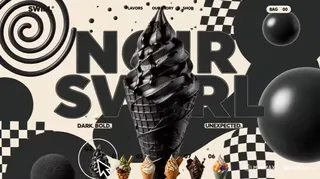
Create a 15-second premium 16:9 animated ice-cream landing page using the uploaded six-ice-cream reference image Image1 as the exact product source. Build a funky cursor-driven experience where the cursor visibly hovers over Ice Cream 01, then 02, 03, 04, 05 and 06.
Every hover instantly brings that exact ice cream into the hero area at approximately 70% screen height while changing the typography, background palette, motion graphics, particles and decorative elements. The interaction must clearly read: cursor hover → thumbnail reacts → matching hero appears → visual world transforms. ART DIRECTION Style: playful 3D e-commerce × Y2K graphics × contemporary editorial design × premium confectionery branding.
Use colorful organic blobs, checkerboards, wavy lines, spirals, squiggles, dots, stars, warped grids, floating spheres and hand-drawn shapes. Keep the design energetic but professionally composed. Each flavor gets its own visual identity while the website structure remains consistent. No HUD, sci-fi graphics, excessive glassmorphism or generic template styling.
TYPOGRAPHY Use bold, chunky, rounded playful typography inspired by Cooper Black, Fredoka and inflated bubble lettering. Product names should be enormous, expressive and slightly irregular. Use a clean geometric sans serif for navigation and small labels. Headlines can squash, stretch and bounce during transitions but must always resolve into perfectly readable text.
PRODUCTS Use exactly: “01 — NOIR SWIRL”, “02 — MATCHA CLOUD”, “03 — CARAMEL TAIYAKI”, “04 — SAKURA DREAM”, “05 — DARK OBSESSION”, “06 — TROPICAL GOLD”. Preserve the exact product designs, toppings, colors, cones and proportions from the reference image.
WEBSITE LAYOUT Top-left: “SWIRL°”. Center: “FLAVORS OUR STORY SHOP”. Top-right: “BAG 00”. Place all six miniature ice creams along the bottom labeled “01 02 03 04 05 06”. The hovered thumbnail rises and enlarges. Position the selected hero slightly right of center at 70% screen height, with enormous product typography behind and beside it. 00:00–00:01 — INTRO Open on a funky cream-yellow background. Organic blobs inflate, stars rotate, wavy lines draw themselves and colorful circles bounce into position. Reveal “SWIRL°”, navigation and all six product thumbnails with staggered spring motion. A circular cursor enters and approaches 01. 00:01–00:03 — 01 NOIR SWIRL Cursor hovers “01”. Thumbnail 01 scales up and NOIR SWIRL launches into the hero area with 3D rotation and elastic overshoot. Display “NOIR SWIRL” and “DARK. BOLD. UNEXPECTED.” Background transforms to cream + charcoal with black spirals, checkerboards, bouncing spheres and ink-like circles. Tiny charcoal particles orbit the product. Hero subtly tilts toward the cursor. 00:03–00:05 — 02 MATCHA CLOUD Cursor slides onto “02”. NOIR SWIRL squashes and exits while MATCHA CLOUD expands from thumbnail 02 into the hero position. Display “MATCHA CLOUD” and “EARTHY. SOFT. ADDICTIVE.” Change the environment to pistachio green + cream + red accents. Animate mochi circles, flowing matcha ribbons, warped checkerboards and rotating rings. Two mochi spheres briefly orbit the hero. Typography performs one soft rubber-like wobble. 00:05–00:07 — 03 CARAMEL TAIYAKI Cursor hovers “03”. MATCHA CLOUD shrinks away while CARAMEL TAIYAKI flips into the hero stage. Display “CARAMEL TAIYAKI” and “CRISPY. GOLDEN. CREAMY.” Background becomes caramel orange + butter yellow + cream. Animate caramel rings, fish-inspired outlines, syrup curves, chunky stars and floating crumbs. A caramel wave sweeps behind the product. 00:07–00:09 — 04 SAKURA DREAM Cursor moves onto “04”. SAKURA DREAM shoots diagonally into the hero position while the previous product exits. Display “SAKURA DREAM” and “SWEET. SOFT. DREAMY.” Transform the page into bubblegum pink + cream + cherry red. Add inflated pink blobs, abstract flowers, hand-drawn hearts, candy dots and flowing ribbons. The giant title briefly inflates like marshmallow before settling. 00:09–00:11 — 05 DARK OBSESSION Cursor hovers “05”. Trigger a flowing chocolate wipe that replaces SAKURA DREAM with DARK OBSESSION. Display “DARK OBSESSION” and “RICH. DEEP. DECADENT.” Background becomes chocolate brown + cocoa + cream. Animate brownie cubes, melted-chocolate curves, squiggles, zigzags and warped checkerboards. Brownie pieces orbit briefly while the hero performs a subtle 3D rotation. 00:11–00:13 — 06 TROPICAL GOLD Cursor reaches “06”. DARK OBSESSION squashes back toward its thumbnail while TROPICAL GOLD bursts upward into the final hero position. Display “TROPICAL GOLD” and “BRIGHT. CREAMY. TROPICAL.” Transform the background into turquoise + mango yellow + cream + small purple accents. Add tropical flowers, sunbursts, mango cubes, turquoise ribbons, stars and wavy patterns. Place a giant warped “06” behind the hero. Mango cubes float around the product with playful physics. 00:13–00:15 — FINAL Keep TROPICAL GOLD as the 70% hero. Cursor briefly sweeps across the six thumbnails, making each bounce and flash its accent color, then returns to 06. Background shapes react with delayed parallax.
“TROPICAL GOLD” stretches and snaps back with spring physics. Reveal “TASTE THE FUN →”. Cursor hovers over the CTA; it magnetically expands, a wavy underline draws beneath it and the arrow shoots right before returning. Hold the final polished composition.
HOVER SYSTEM Every transition must clearly be caused by cursor hover in the exact sequence “01 → 02 → 03 → 04 → 05 → 06”. On each hover: enlarge the thumbnail, replace the hero, update the title and tagline, change the background palette and trigger unique flavor-specific motion graphics. Never make the sequence look like automatic slideshow cuts. MOTION STYLE Use 60 fps WebGL / GSAP / Framer Motion-quality animation with spring physics, magnetic cursor interactions, squash-and-stretch, elastic overshoot, 3D rotations, cursor-responsive tilt, kinetic typography, morphing blobs, animated squiggles, ingredient particles, liquid wipes, masking and layered parallax. Keep motion playful, smooth and premium.
TEXT ACCURACY Every visible word must render exactly as written. No filler text, random characters, misspellings, broken typography, fake logos or extra navigation. Hide outgoing typography with masks before revealing new text so malformed transitional letters are never visible. COMPOSITION Maintain hierarchy: 70% hero ice cream → giant playful product name → funky motion graphics → tagline → flavor selector → navigation. Typography may partially pass behind the hero for depth but must remain readable. Keep decorative graphics away from important UI. The final result should feel like an award-winning interactive ice-cream website combining premium 3D products, playful typography, funky graphic backgrounds and responsive hover-driven motion.