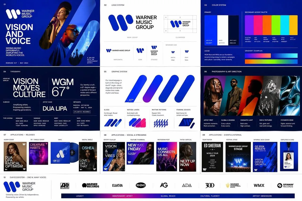
A polished multi-page rebrand kit concept for Warner Music Group, featuring the iconic W symbol as a central anchor with refreshed geometric compositions and diagonal energy inspired by the 67-degree angle. Primary palette of deep confident blue and white, layered with vivid music-inspired accent colors. Editorial and cinematic mood with strong grids, generous negative space, and expressive contemporary typography. Includes logo lockups, color system, typography styles, photography treatments, graphic devices based on diagonals and slices, and templates for album covers, playlists, social posts, tour posters, and internal decks. The system scales across sub-brands while feeling unmistakably Warner Music Group. Balance corporate clarity with creative edge using motion-inspired layering, rhythmic patterning, and bold artist imagery. --ar 16:9 --v 7 --style raw